Location and Age Estimator
Project Overview
The purpose of the project is to predict where someone is from and what their age is based on their responses to a survey. The predictions are updated after every question is answered. We visually depict these predictions using a map of the US and an age line. We use two datasets (grammar and earthquake) as background information to make our predictions as well as our knowledge of Bayesian statistics.
Results
We had several people interact with our project and answer the questions. When they were done answering, it often gave a clear picture of where our model thinks the person is from and how old they are with concentrated lighter colors representing a higher probability. It is not always accurate in its predicitions but we are assuming this is due to the limitations of the data sets we chose (it is not entirely clear that they provide a strong correlation between the results and the age and location information that we are looking for). It is also really interesting to see that as people answer questions their responses affect the probabilities in different ways. For example, it seems that the comma questions contribute more to the probabilities people are from various age groups, while the earthquake questions contribute more to the probabilities of people being from certain locations.
 Above is a screenshot of our full interactive data visualization
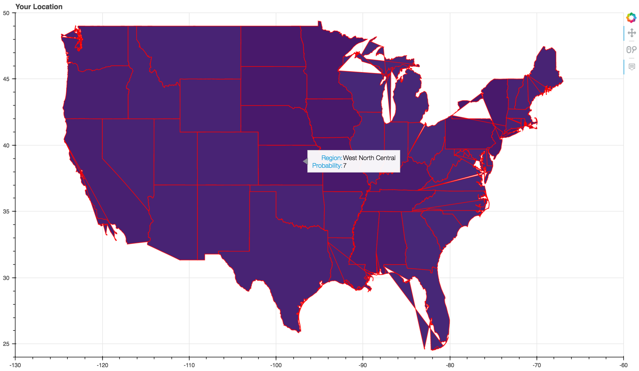
 This is a zoom in of the map visualization with the hover tool.
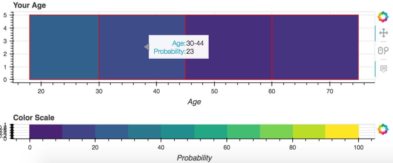
 This is a zoom in of the age line visualization with the color scale line and hover tool.

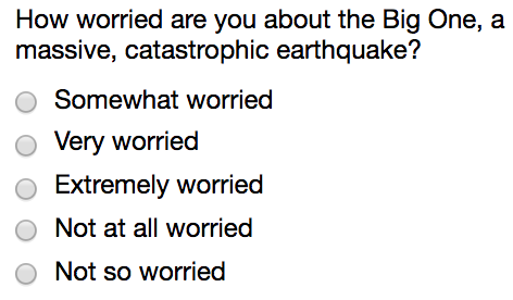
This is a zoom in of an example question.
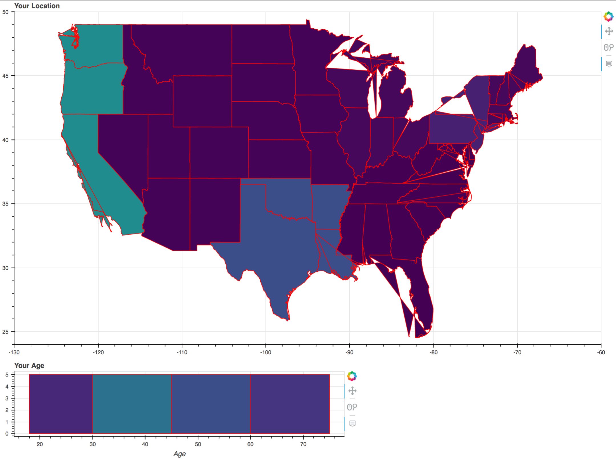
 This is an example of the final visuals after all the questions have been run through.

This is an example of a final statement.
Implementation
From the two datasets, we gathered statistical information about the correlation between an answer to a question and the likelihood someone is from a location and is of a certain age. We used our knowledge of Bayesian statistics to update these probabilities after each question is answered. The questions serve as the controller which updates the model which is the probabilities of what we know about a person based on their answers to various questions. The model immediately updates the view being the pictures of the United States and the age line. The colors and hover titles change to represent the updated probabilities that a person is from a given location and age group based on their answer to the question.
We implemented several classes all representing different pieces of our program. We have a Data class which represents the data files as we pulled them in from the internet. Inside the Data class we have methods which could organize the data in ways such that we could easily access and use various aspects of the data later in our project. We manipulate the data in our Interpret class which represented the model of our model view controller. We had four main view classes. One represented the map object, another the age line object, another a scale line representing the color scale, and lastly one to represent the layout of all these objects as whole. The Map object uses the Bokeh library to create a map of the United States. There are a few inaccuracies in the file that we downloaded from the internet, rendering a map that has some peculiarities. The Question class served as our controller, providing the user an outlet to input an answer to a question on the view and then sending that data to the model to update the view accordingly. Lastly, Integration is a class which communicates between our model, controller, and our view objects and coordinates between them.
 Above is the full UML diagram for the implementation of our data visualization
One decision we made where we had to decide between multiple alternatives was when we decided on what library we wanted to use. We were torn between trying to make PyGame work with some combination of other graphing and map interfaces and choosing a different library entirely, such as Bokeh. We ended up making the decision to move to Bokeh because it was going to be very difficult to do what we wanted to do with PyGame and we found that Bokeh had a great variety of resources and tips on how to do the types of data visualizations we were trying to do. It was a tough decision to make, especially after devoting several hours to getting a map and running with geoplotlib, but it was definitely good in the long run that we made the decision we did as Bokeh ended up being the perfect library for our project.
Reflection
The project was well scoped in that we were able to accomplish most of what we wanted in the time given while still challenging us. It was ambitious but both of us were excited about it and willing to invest a good amount of time into the success of the project. We learned a lot about using different libraries and carefully implementing new features. We also found that adding print statements and adding features slowly made debugging much less difficult. In general, the project seemed to flow very nicely. The only thing we might consider changing was the way in which we tested things. We might consider adding more unit tests so that we have less issues with debugging and small errors later in the process. It would also probably have been better to draw our UML diagram sooner and add more comments in our code as we went along rather than add documentation at the end. I would say the one issue with choosing such an ambitious project was that we found ourselves just trying to get things done and make them work in whatever way possible as opposed to making nicer, cleaner code.
We split up the work by writing different classes, just as planned. We split the work fairly evenly between us and helped each other with debugging and merging. We also did some pair programming on some of the more complicated Bokeh and integration pieces of the project. We were very excited whenever we got a feature of our program to work and generally had a very good experience.