Results
For our project we created a website deployed on heroku which predicts future prices for various items using a seasonal ARIMA predictive model. Seasonal trends occur when there is a repeating pattern of an item being more expensive at a certain time of year. For example, winter coats would be more expensive in the winter than in the summer. Overall trends occur when the price of an item tends to go up or down as the years go by. We used seasonality and trends in items to determine when the best time for a person to buy a certain product is, both in terms of seasonal and overall trend variations. Our model outputs a visualization of the price graph. We included a hover tool which shows what the price is, the date that that price occurred, and whether that price is within 10% of the cheapest price. The following images display our interactive website.
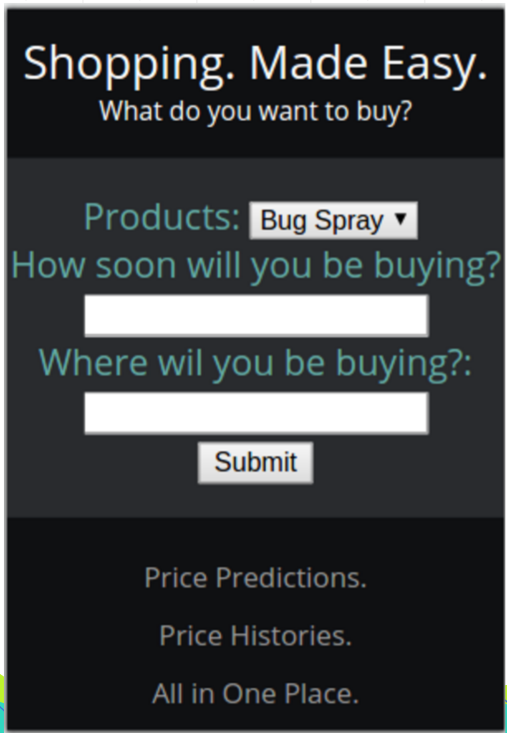
This is a screenshot of our user interface website home page.
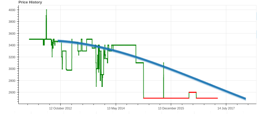
This is the output of our model with limited data we were able to collect and format from Amazon. Blue represents our model’s price forecast. Green and red represents the original price history of the item.
In order to test the accuracy of our model, we trained our model using only 100 days of data, and observed the fit of our model with the rest of the data set. This is displayed on the graph below. The red represents the predicted price, and the blue displays the true price of electricity.
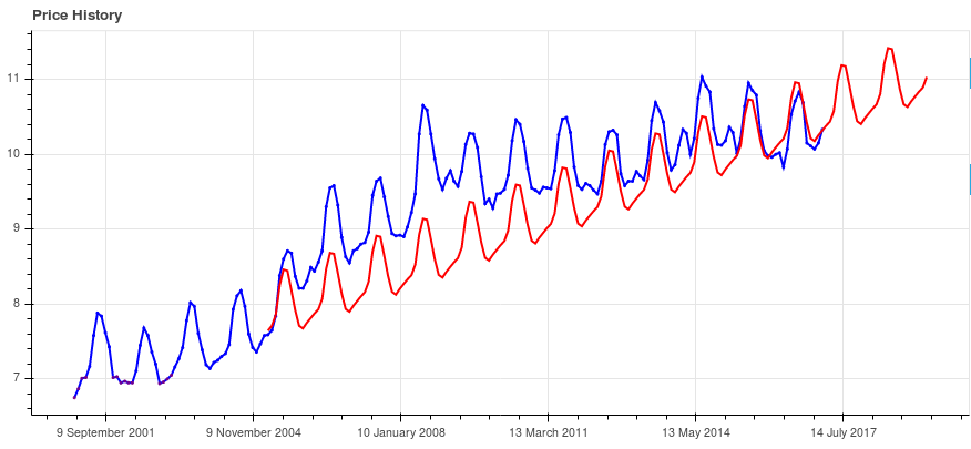
Once we were confident that our model could predict accurately, we forecasted what the price would be for the future 26 months. The predicted and actual values are displayed in the graph below. Again, the predicted prices are in red, and the true price are in blue.
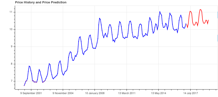
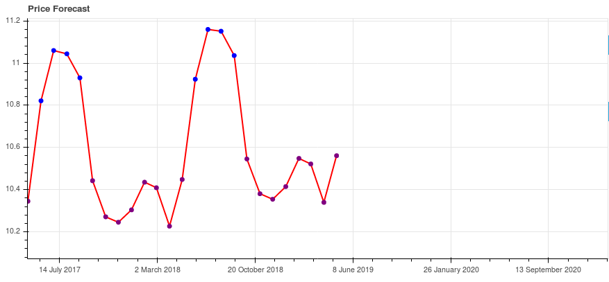
The following graph shows what the user would see on the website, which contains only the predicted values for the amount of days that the user inputted. The purple nodes represent the prices are the lowest 5% prices for that range, whereas the blue nodes represent the highest 5% prices for that specific time period.
The website allows any user to determine future prices for certain products. For oil and electricity prices, this model can influence a user by making them more aware of the effects extraneous electricity use can have on their wallets in peak price months. Additionally, it might give them insight as to when is the best time to buy stock in these two markets. Furthermore, this model can be used for any product, assuming there is significant amount of price history data.